
Last year, Microsoft launched a preview of the ‘new look’ feature to modernise and simplify the user experience in the Power BI service. The initial release was focused on improving overall the report viewing experience by introducing a vertical page navigation, surfacing additional metadata, simplifying the action bar. Since then, efforts have been made to further improve the new look experience and gradual updates to validate the design.
This week, Microsoft have announced that they are bringing the modern look and feel of the new look to a place where most of us spend time collaborating and managing content- workspaces.
Get ready for the ‘new look’ of workspaces in the Power BI service!

Spanish Point solutions allow you to think big whilst starting small, take steps toward becoming a connected enterprise and focus on delivering quick insights for each business problem. Transform your organisation into a data-driven, connected enterprise
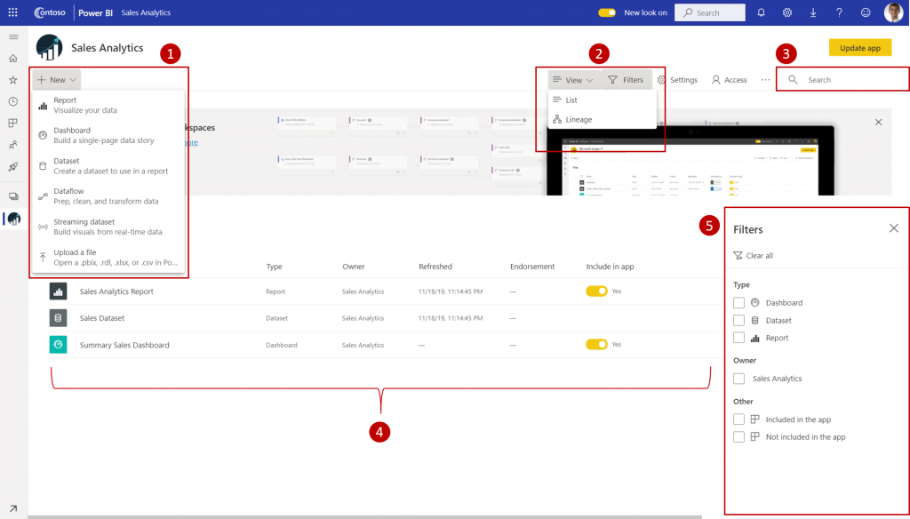
All workspaces, including classic and new workspaces, will receive the modern look and feel provided that the ‘new look’ toggle is turned on. Below we have a summary of what’s changed:

1. Get Data: It is now much easier for users to add content to their workspace. The + New button provides one-click access to connect to data, open files, and create new reports, dashboards, and more.
2. View switcher: To see the connections between dataflows, datasets, reports, and dashboards and their connections to other data sources, users have an entry point in the top command bar to switch between list view and lineage view.
3. Search within workspace: Users will be able to search across all the content within their workspace with the new search box.
4. List and tabs: The original tabs have been restructured to give users a flat list of content like SharePoint. Users will no longer be landing on the ‘dashboards’ tab after opening a workspace and getting confused. See the new tab order:
5. Filters: For workspaces with hundreds of artifacts, users will be able to quickly filter the content using the new filters pane. Once a filter is applied, users will be able to see the filter on top of the content list.
6. Quick actions: All the quick actions for your content will be available on hover. The most common actions will be accessible in a single click, and everything else will be in the “…” ellipses menu.
7. New colours and icons – There is now lighter colour theme and updated icons within the workspace based on the Microsoft Fluent design system.
As many people will need time to adapt to the new design, all Power BI service users will be able to opt into the new look of workspaces using the existing New Look toggle

Join us for a day as Spanish Point host a Power BI bootcamp!